Why We Crave That “Inky” Old-Fashioned Feel
There’s something magical about a real typewriter. It’s not the perfection of a computer; it’s the imperfect, authentic inky look. It’s the feel of ink bleeding into paper, the slight misalignment of keys. It feels real, tangible, and full of old-fashioned charm.
But finding free typewriter fonts that capture this vintage feel is tough. Many are too clean, too digital. That’s why we did the hard work. This isn’t just a list; it’s a curated collection of 17 fonts that deliver that true inky and vintage aesthetic you’re searching for.
Part 1: The “Heavy Ink & Smudged” Fonts
These fonts are perfect for a bold, saturated, ‘freshly-typed’ look with realistic ink bleed.
1. Special Elite
Special Elite is the crown jewel of inky typewriter fonts. Created by Brian J. Bonislawsky of Astigmatic (AOETI), this font perfectly captures the essence of a well-used manual typewriter with heavy, ink-saturated keys.
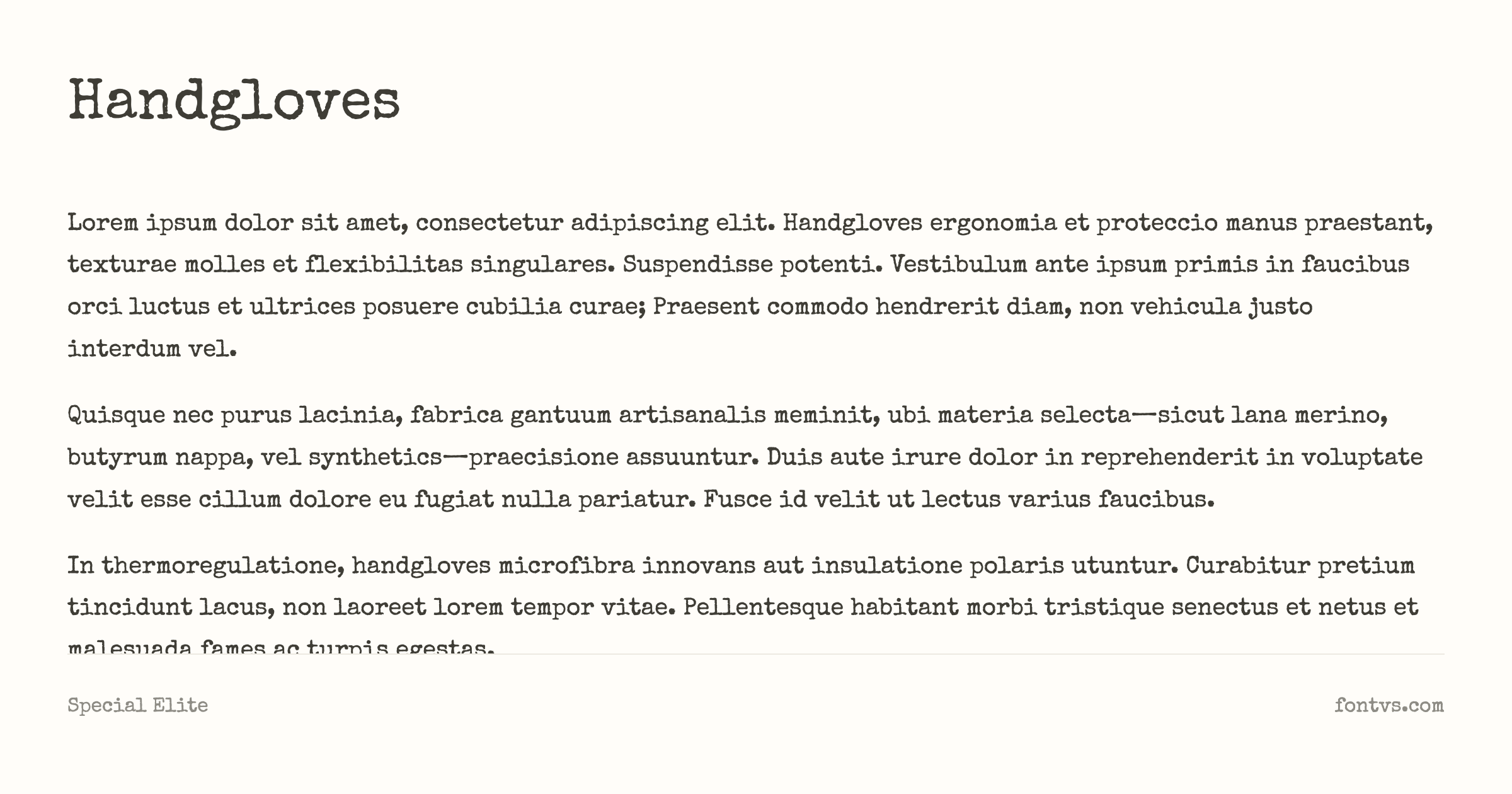
What Makes It Special:
The beauty of Special Elite lies in its authentic imperfections. Each character shows realistic ink bleed, giving your text that freshly-typed appearance as if the keys just struck paper moments ago. The letterforms are bold and confident, with slight irregularities that make it feel genuinely vintage rather than digitally manufactured.
Best Used For:
- Headline and display work — The bold nature makes it perfect for attention-grabbing titles
- Vintage posters and prints — Creates an authentic 1940s-1960s aesthetic
- Book covers — Especially for noir, detective, or historical fiction
- Branding — Ideal for businesses seeking a retro, authentic vibe
Technical Details:
| Property | Value |
|---|---|
| Family Name | Special Elite |
| Version | 1.001 |
| Glyphs | 370 |
| Characters | 368 |
| Designer | Astigmatic (AOETI) |
| License | Apache 2.0 (Free for commercial use) |
| PostScript Name | SpecialElite-Regular |
| Font Details | Test it on FontVS |
| Download | Get it from Google Fonts |
Pro Tip: Special Elite works best at larger sizes (18pt+) where the ink bleed details are visible. Pair it with a clean sans-serif for body text to create beautiful contrast between vintage headlines and modern readability.
2. 1942 Report
1942 Report captures the aesthetic of military typewriters from the World War II era. This font has a distinctive technical precision while maintaining the mechanical charm of vintage typewriters. Created by Johan Holmdahl.
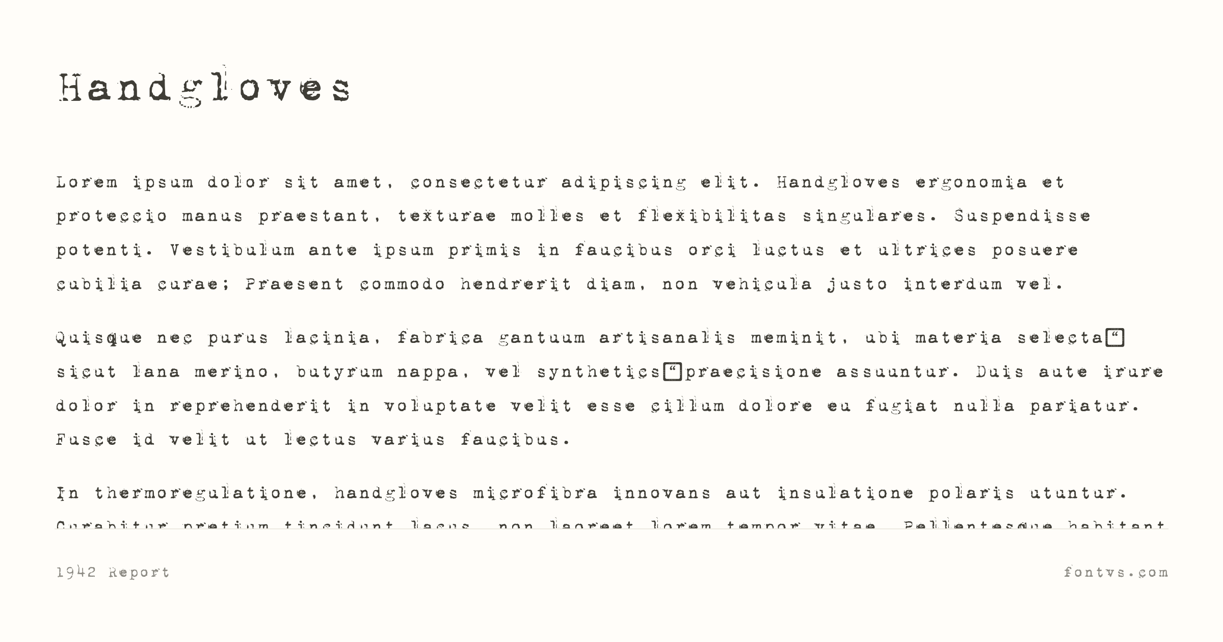
What Makes It Special:
The military heritage of 1942 Report gives it a unique authority and precision. The letterforms are clean and functional, with just enough variation to feel authentically mechanical rather than digitally perfect. It evokes the look of official military correspondence and technical reports from the 1940s.
Best Used For:
- Military and historical designs — Perfect for WWII-themed projects
- Technical manuals — Authoritative appearance for instructions and documentation
- Espionage and thriller themes — Creates authentic secret document aesthetics
- Vintage technical illustrations — Pairs well with engineering drawings and schematics
Technical Details:
| Property | Value |
|---|---|
| Family Name | 1942 Report |
| Version | 2001 Freeware |
| Glyphs | 95 |
| Characters | 92 |
| Designer | Johan Holmdahl |
| License | Freely use, distributable, sellable, and modifiable with required disclaimer inclusion |
| PostScript Name | 1942report |
| Download | Get it from Dafont |
Pro Tip: 1942 Report looks particularly authentic when paired with aged paper textures and official-looking stamps or seals. Use it with justified alignment for that official document appearance.
3. My Old Remington
My Old Remington captures the rough, worn character of early 20th‑century Remington typewriters, with the look of heavily used mechanical print rather than clean digital output. It was created by Swedish designer Johan Holmdahl in 1999 as a classic distressed typewriter display face.
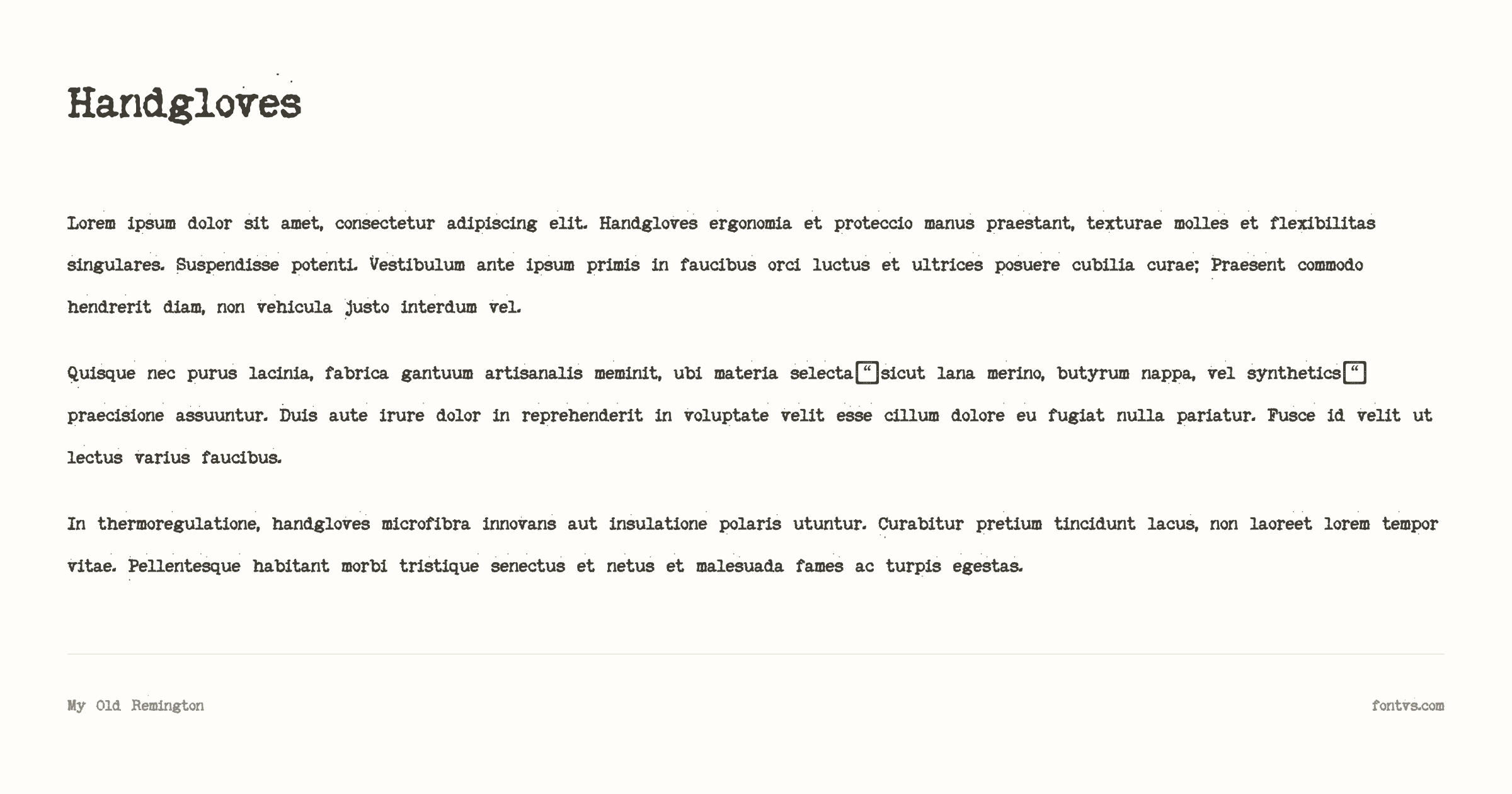
What Makes It Special:
My Old Remington stands out because it combines the near‑monospaced, utilitarian structure of traditional typewriter faces with clearly visible aging and ink irregularities. The letterforms have rough, slightly broken edges and uneven inking, so text feels like it was hammered onto paper by an old, overused machine instead of rendered by software. This balance of legibility and “damaged” texture makes it ideal when you want something that reads clearly but instantly signals nostalgia, archives, or analog authenticity.
Best Used For:
- Archival and dossier designs — Perfect for case files, evidence folders, library cards, and bureaucratic paperwork aesthetics
- Personal and literary projects — Great for diaries, letters, memoirs, and captions on old photos, emphasizing memory and sentimentality
- Crime, mystery, and documentary themes — Works well for detective novels, investigation files, redacted documents, and “typewritten” reports in thrillers
- Retro UI and film graphics — Suitable for on‑screen terminal overlays, typewriter sequences, and chapter titles in period pieces or documentaries
Technical Details:
| Property | Value |
|---|---|
| Family Name | My Old Remington |
| Version | 1999; 1.0 |
| Glyphs | 91 |
| Characters | 88 |
| Designer | Johan Holmdahl |
| License | Free. Freeware, No rights reserved. |
| PostScript Name | MyOldRemington |
| Download | Get it from Dafont |
Pro Tip: My Old Remington looks most authentic at larger sizes where its distressed texture is clearly visible. Pair it with aged paper backgrounds, subtle noise or grain, stamps and seals, and handwritten annotations to fully sell the “old typewritten document” illusion. Use slightly increased line spacing and left or justified alignment to mimic real typewritten pages.
4. Estonia
Estonia is a calligraphic script from American designer Robert E. Leuschke, originally released through his TypeSETit foundry and later added to Google Fonts. It is based on expressive calligraphy from Estonia itself, with swash stylistic sets designed to be layered on top of the regular style for extra flourish. Described as a distressed, Eastern‑European–inspired script, it has just enough roughness and texture to feel inky rather than sterile.
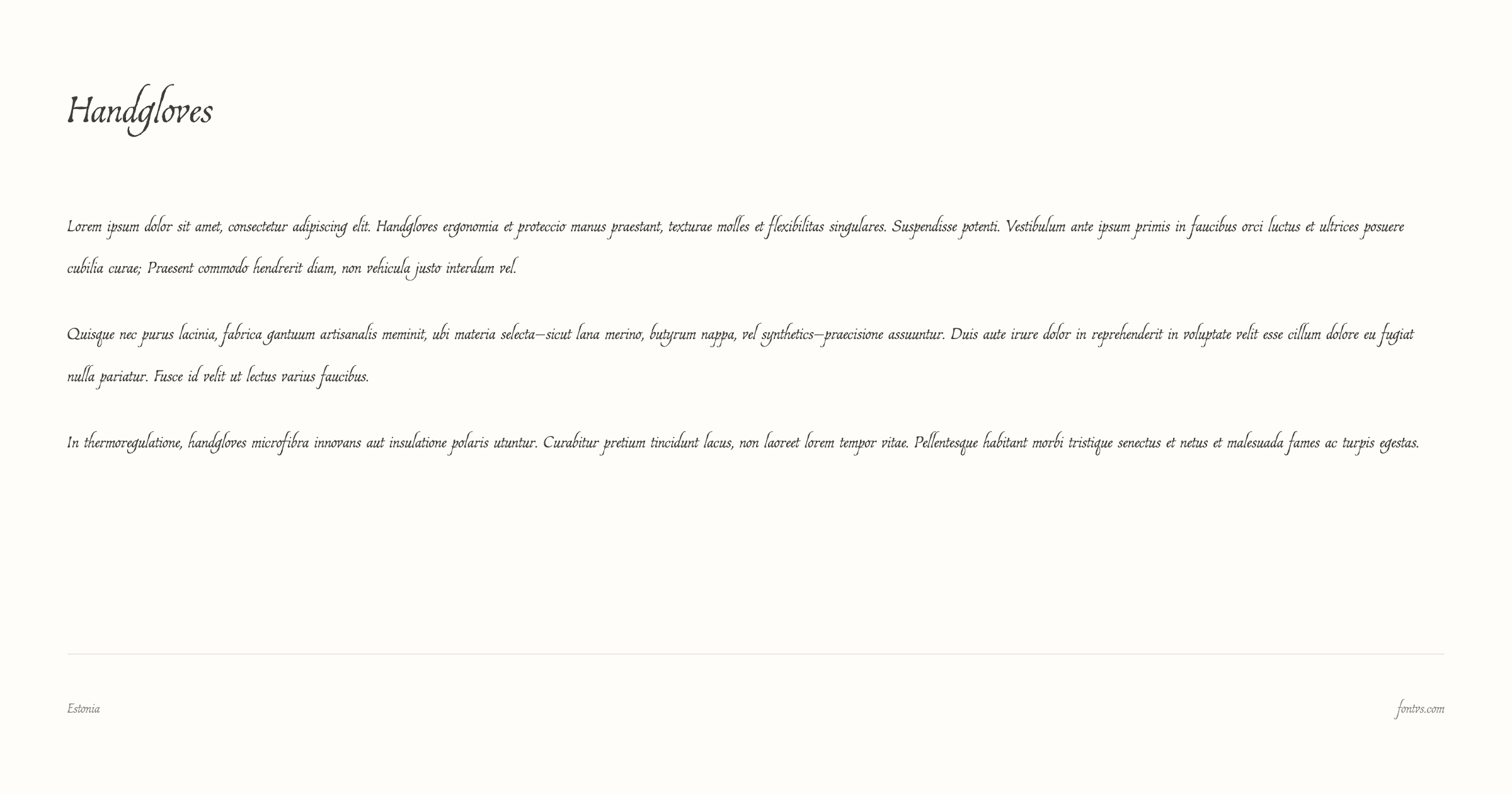
What Makes It Special:
Estonia stands out because it feels like handwriting that’s been dragged across slightly toothy paper—elegant, but with tiny irregularities and texture that keep it from looking like a vector-perfect wedding script. The main style is a readable, connected script, while the optional swash sets add looping caps and tails that can mimic the look of a fountain pen getting a little heavy on ink at the start and end of strokes. With support for Latin, extended Latin and Vietnamese, it’s also surprisingly versatile for a decorative, calligraphic face.
Best Used For:
- Romantic and literary titles — Perfect for letters, diaries, poetry covers, and “handwritten” notes layered over photos
- Vintage packaging and logos — Works well for artisanal coffee, perfume, stationery, and boutique brands that want an old‑world, ink‑on‑paper personality
- Invitations and personal stationery — Ideal for wedding suites, greeting cards, and event posters where you want a formal but slightly weathered script
- Chapter openers and pull quotes — Great as an accent script paired with a clean serif or sans in editorial layouts
Technical Details:
| Property | Value |
|---|---|
| Family Name | Estonia |
| Version | Version 1.014; ttfautohint (v1.8.3) |
| Glyphs | 1681 |
| Characters | 596 |
| Designer | Robert E. Leuschke |
| License | SIL Open Font License (Free for commercial use) |
| PostScript Name | Estonia-Regular |
| Font Details | Test it on FontVS |
| Download | Get it from Google Fonts |
Pro Tip: Use Estonia sparingly as a display accent and avoid setting long paragraphs in it; keep it to titles, short phrases, and signatures, and pair it with a simple serif or sans (like Merriweather or Inter) so the inky calligraphic texture feels intentional rather than overwhelming.
5. Syne Mono
Syne Mono is the monospaced member of the Syne superfamily, originally developed for the French art center Synesthésie and designed by Lucas Descroix in collaboration with Bonjour Monde. It takes the base Syne proportions and runs them through a custom distortion process that flips on‑curve points to off‑curve, creating a quirky, slightly “glitched” feel that reads like a restless, over‑inked typewriter.
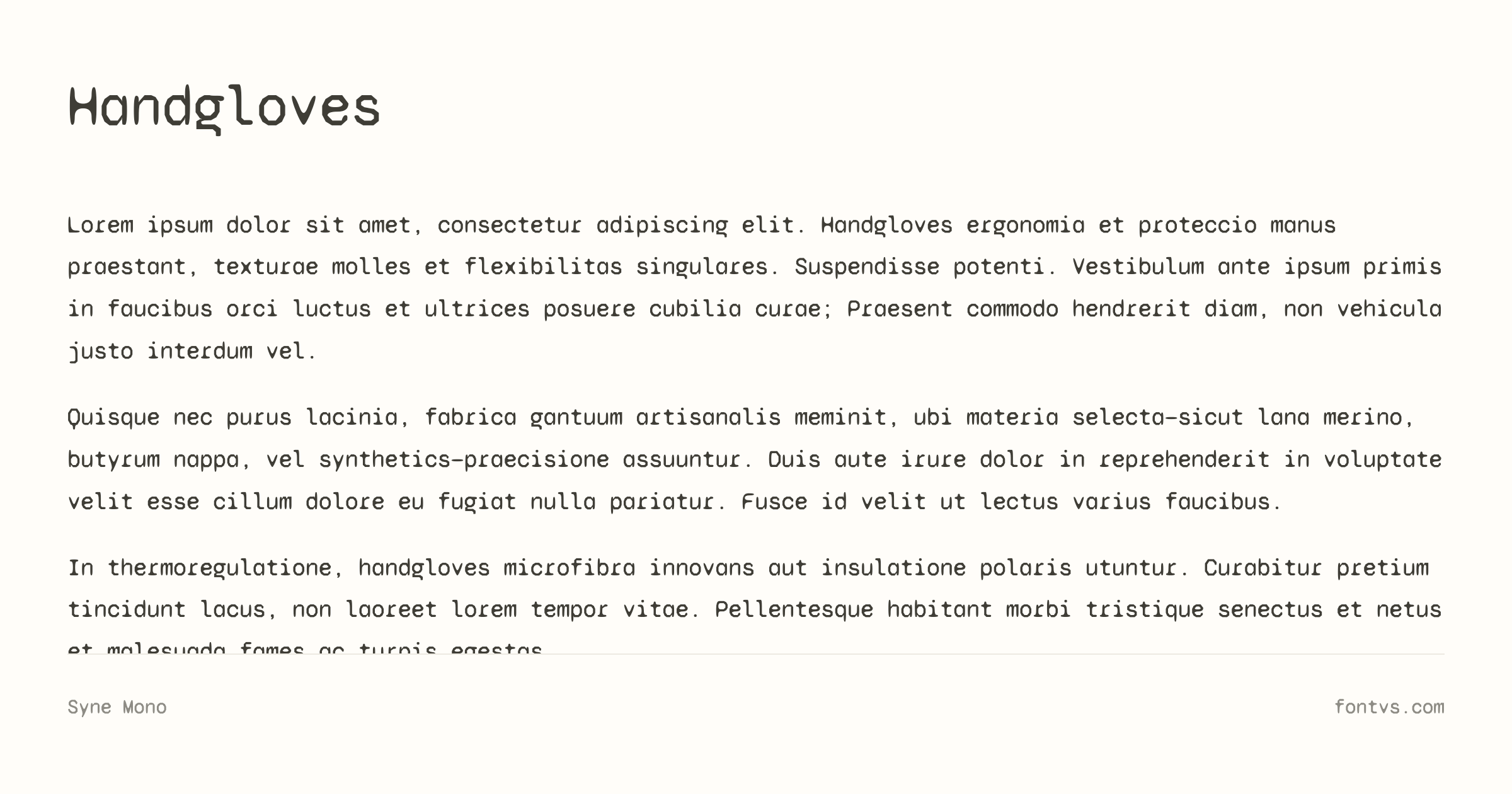
What Makes It Special:
Unlike classic typewriter faces that aim for mechanical neutrality, Syne Mono leans into experimental, almost brutalist shapes: terminals kink unexpectedly, curves feel a bit off, and the rhythm is deliberately irregular. That controlled distortion gives it a noisy, inky, “mis-hit key” energy—like a typewriter that’s been modified by an artist rather than a maintenance tech. Because it’s fully monospaced, you still get that rigid typewriter grid, but the individual letters look slightly warped and handmade, which is great when you want analog chaos on top of digital structure.
Best Used For:
- Experimental titles and posters — Amazing for zines, indie film posters, and gallery flyers where you want code‑meets‑typewriter vibes
- Glitchy UI and terminal aesthetics — Ideal for fake command‑line interfaces, retro hacking overlays, or sci‑fi UIs with a broken‑machine personality
- Technical content with an edge — Works for code snippets, labels, or metadata when you want something more expressive than a standard coding font
- Branding for creative tech — Great for studios, festivals, or products that sit between art and technology
Technical Details:
| Property | Value |
|---|---|
| Family Name | Syne Mono |
| Version | Version 2.000; ttfautohint (v1.8.3) |
| Glyphs | 603 |
| Characters | 378 |
| Designer | Lucas Descroix |
| Manufacturer | Bonjour Monde |
| License | SIL Open Font License (Free for commercial use) |
| PostScript Name | SyneMono-Regular |
| Font Details | Test it on FontVS |
| Download | Get it from Google Fonts |
Pro Tip: Syne Mono is at its best when you lean into its weirdness—use generous letterspacing, larger sizes, and plenty of white space so the “glitchy ink” details are visible, and pair it with a very restrained sans (like Inter or Space Grotesk) to keep layouts from feeling chaotic.
6. CarbonType
CarbonType is a classic free typewriter display font by Vic Fieger, designed to look like text hammered out by an imperfect, aging machine. The letters are sturdy and monolinear, but with subtle distortions, broken edges, and inconsistent inking that collectively read as distinctly analog and worn‑in.
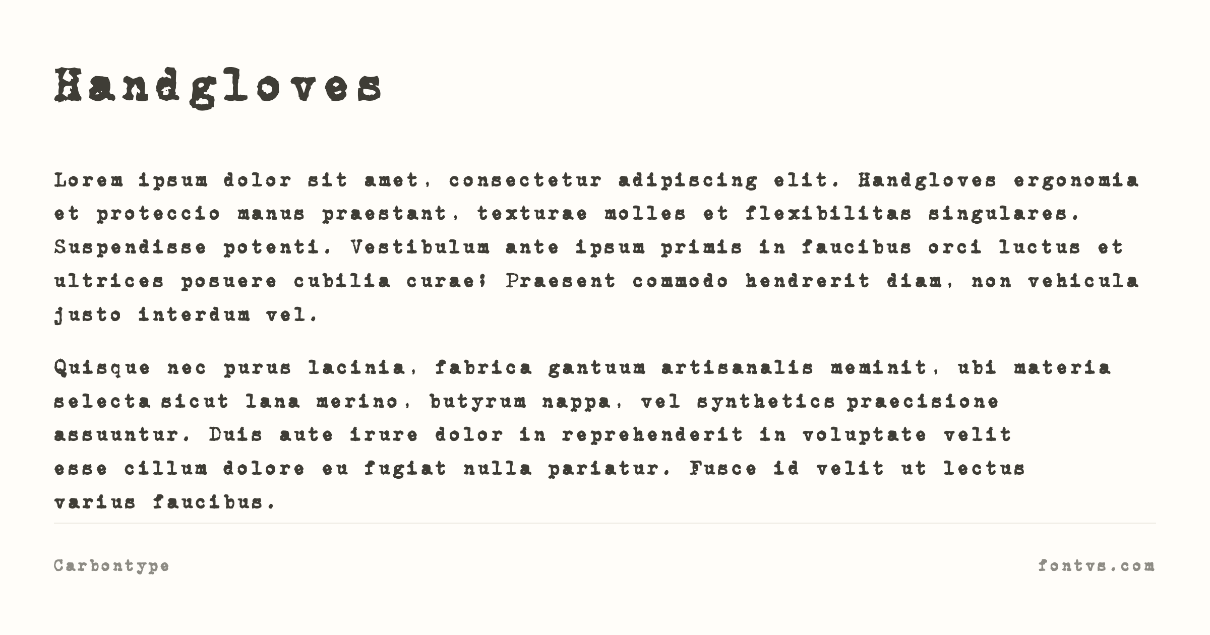
What Makes It Special:
CarbonType’s charm lies in its slightly uneven, distressed outlines—strokes don’t meet with laser precision, and curves feel a little lumpy, like metal type that’s seen decades of use. The uppercase letters in particular are bold and assertive, with enough roughness to look like they’ve been over‑inked or pressed into textured stock, giving your text that gritty, “rescued from a filing cabinet” authenticity. Although it’s categorized as a typewriter font, it pushes more toward retro poster territory, making it perfect when you want heavy, inky drama rather than subtle simulation.
Best Used For:
- Big, retro headlines — Ideal for posters, cover art, and hero graphics where you want loud, high‑contrast, “old machine” energy
- Vintage branding and apparel — Works well on T‑shirts, labels, and logos that aim for a rugged, workshop or industrial aesthetic
- Title cards and section dividers — Great for zines, dossiers, and slide titles where you only need a few strong words in a distressed typewriter style
- Web headers and hero text — Use it sparingly in UI for top‑level headings paired with a clean sans for everything else
Technical Details:
| Property | Value |
|---|---|
| Family Name | CarbonType |
| Version | Version 1.0 |
| Glyphs | 247 |
| Characters | 80 |
| Designer | High-Logic - Erwin Denissen 1999 |
| Manufacturer | High-Logic |
| License | Free. Freeware, No rights reserved. |
| PostScript Name | CarbonType |
| Download | Get it from Dafont |
Pro Tip: CarbonType works best when you really lean into the distressed look—set it large, add paper grain or photocopy textures beneath, and keep your color palette simple (black, off‑white, maybe one accent color) to let the inky imperfections do the heavy lifting.
7. AA Typewriter
AA Typewriter is a slab‑serif typewriter font by Attila Acs that blends the proportions and feel of an old American typewriter with cleaner, modernized outlines. It’s less chaotic than heavily distressed faces, but still has enough mechanical flavor and slight irregularity to feel convincingly analog on the page.
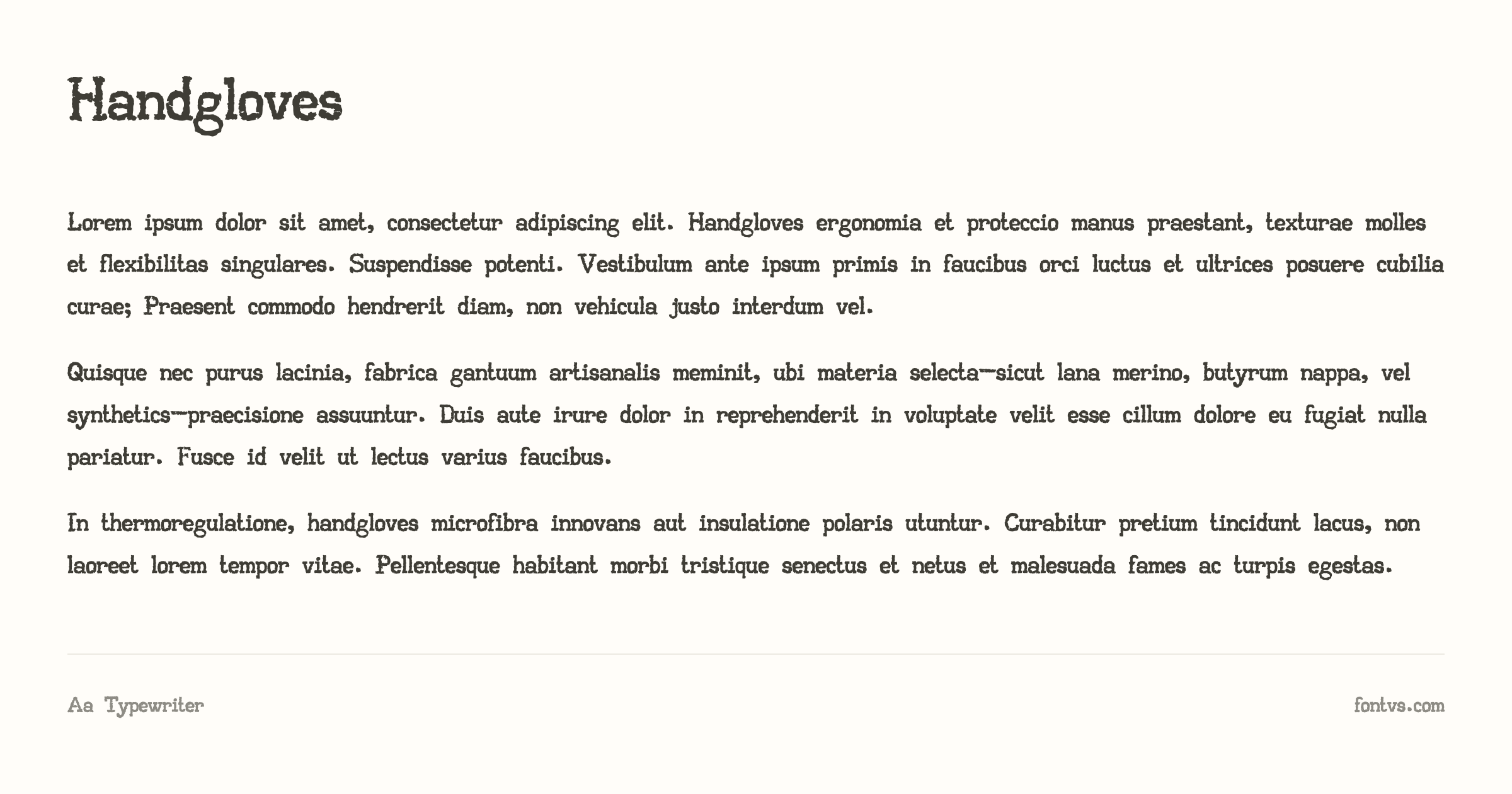
What Makes It Special:
The designer describes AA Typewriter as being based on an old American typewriter but refined with “modern clear lines” to keep it readable even at small sizes. The slab serifs, slightly chunky strokes, and subtle imperfections give you that familiar typewriter voice without the extreme smudging or damage of more experimental fonts. With full Latin‑1 and Mac OS Roman coverage, it’s robust enough for real body text while still looking like it was struck by metal arms instead of rendered by software.
Best Used For:
- Reports, letters, and memos — Ideal when you want text that reads clearly but still carries a vintage office or bureaucratic vibe
- Interface mockups and faux documents — Great for on‑screen dossiers, case files, and paper props in games, films, or UI
- Body copy with typewriter flavor — Works well for full pages of text where more distressed fonts would become tiring
- Retro branding and packaging — Suitable for labels, coffee bags, and stationery that hint at analog origins without looking overly grungy
Technical Details:
| Property | Value |
|---|---|
| Family Name | AA Typewriter |
| Version | Version 1.000 |
| Glyphs | 251 |
| Characters | 243 |
| Designer | Attila Acs |
| Manufacturer | Attila Acs |
| License | SIL Open Font License (Free for commercial use) |
| PostScript Name | AATypewriter |
| Download | Get it from Dafont |
Pro Tip: When you use AA Typewriter for longer texts, add slightly increased line spacing and keep the size around 11–13pt in print (or equivalent on screen) to preserve readability while still retaining that dense, typewritten feel.
Part 2: The “Clean & Crisp” Typewriter Fonts
These fonts offer the classic typewriter aesthetic without heavy distress, perfect for readability while maintaining vintage charm.
8. Courier Prime
Courier Prime is Alan Dague‑Greene’s modern refinement of IBM’s classic Courier, commissioned by screenwriter John August and released through Quote‑Unquote Apps. Designed specifically for screenplays, it keeps the monospaced, typewriter logic of Courier while tightening the letterforms for better rhythm and on‑screen clarity.
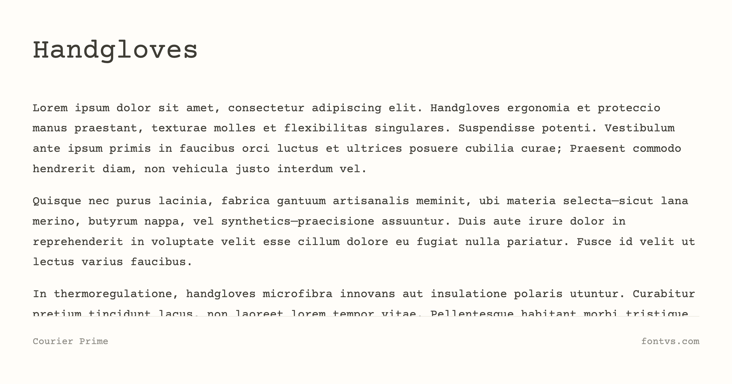
What Makes It Special:
Courier Prime’s serifs are crisper and less rounded than traditional Courier, and its counters are subtly wider, making blocks of text feel lighter and more legible. The bold weight is darker and the italics more cursive, giving you a richer typographic palette while still maintaining the strict one‑character‑per‑cell monospacing screenwriters depend on. Because it was engineered for print and digital scripts, the spacing is meticulously tuned so each page of text maps closely to time on screen, preserving the industry “one page ≈ one minute” convention.
Best Used For:
- Screenplays and scripts — Its entire reason for existence; if you’re writing for film or TV, this is the go‑to “clean Courier”
- Technical documentation and code samples — Great when you want a typewriter aesthetic that’s more refined than Courier New but still strictly monospaced
- Manuscripts and editing drafts — The clear shapes and consistent spacing make it comfortable for long‑form editing and proofing
- UI that references scripts or terminals — Useful in apps where you want a readable, typewriter‑inspired mono font
Technical Details:
| Property | Value |
|---|---|
| Family Name | Courier Prime |
| Version | Version 3.018 |
| Glyphs | 400 |
| Characters | 382 |
| Designer | Alan Dague-Greene, Quote-Unquote Apps |
| Manufacturer | Quote-Unquote Apps |
| License | SIL Open Font License (Free for commercial use) |
| PostScript Name | CourierPrime-Regular |
| Font Details | Test it on FontVS |
| Download | Get it from Google Fonts |
Pro Tip: If you’re using Courier Prime for on‑screen reading, bump the size slightly above your usual mono font and keep line length tight (60–70 characters) so its crisp but relatively open counters don’t feel too airy.
9. TT2020
TT2020 is a hyperrealistic, multilingual typewriter font by Fredrick R. Brennan, designed to simulate the subtle variations of a real IBM Selectric keyball. Instead of repeating identical shapes, it stores multiple versions of each glyph and uses OpenType contextual alternates to shuffle them, so repeated letters never look exactly the same.
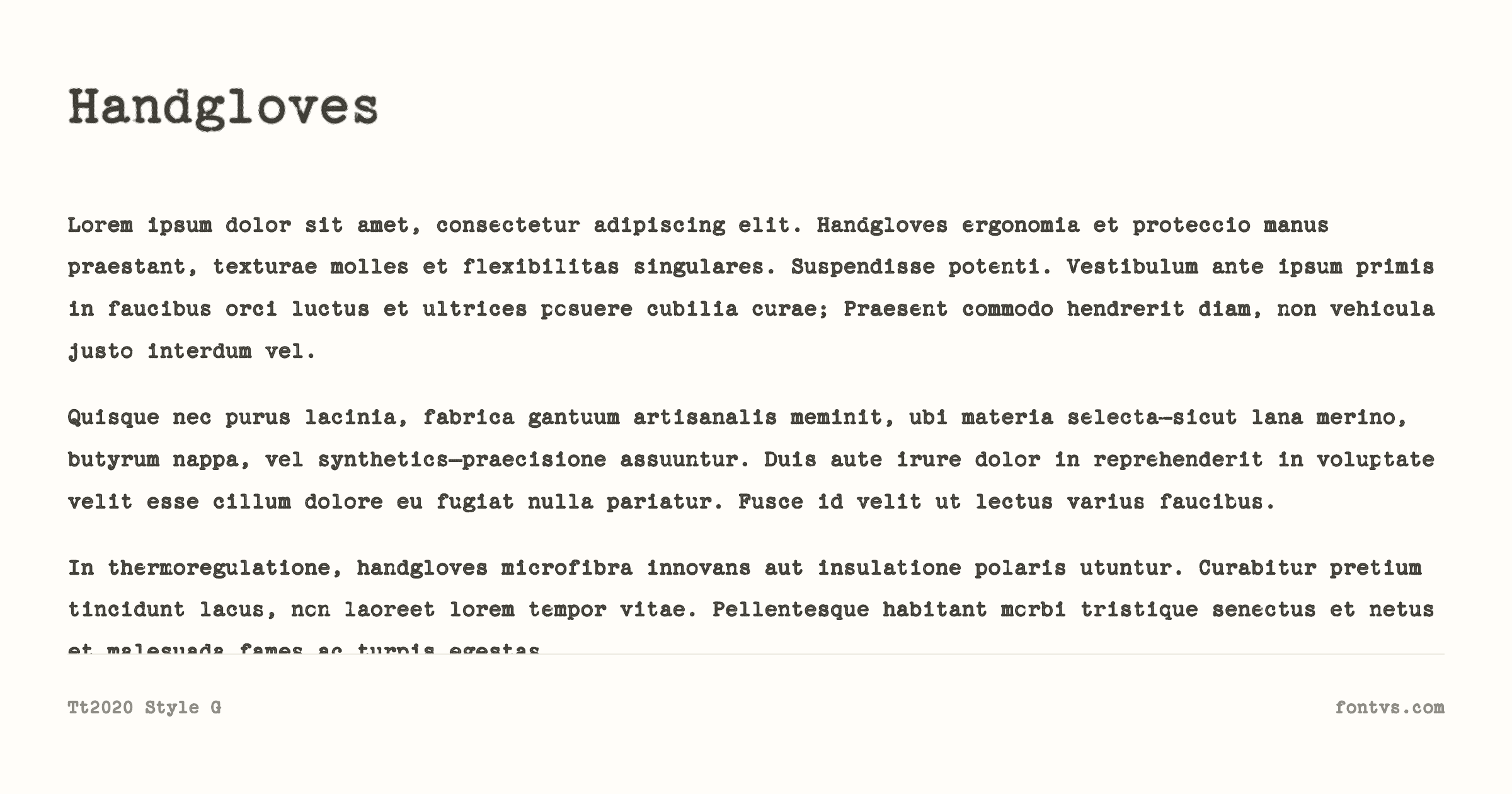
What Makes It Special:
Most digital typewriter fonts render every “E” or “A” identically, but TT2020 includes many slightly different copies of each glyph (nine or ten, depending on style), and picks among them as you type. This small, algorithmic randomness perfectly mimics how physical typewriters vary with pressure and angle, resulting in text that feels uncannily real while remaining sharp and highly legible. Beyond Latin, TT2020 also includes Cyrillic, Greek, and Hebrew, making it unusually global for such a specialized display family.
There are six distinct TT2020 styles designed to simulate authentic IBM Selectric variations: Base, Style B, Style D, Style E, Style F, and Style G.
Best Used For:
- Ultra‑authentic “typed” documents — Perfect for manifestos, reports, and dossiers that must look like they literally came off a Selectric
- Books, articles, and essays that lean into typewriter aesthetics — Works for both display and body text when you want realism without sacrificing clarity
- Film props and motion graphics — Amazing for close‑up shots of letters, files, and on‑screen typing where repetition would break the illusion
- Multi‑language projects — One of the few typewriter fonts capable of handling Latin, Cyrillic, Greek, and Hebrew consistently
Technical Details:
| Property | Value |
|---|---|
| Family Name | TT2020 |
| Version | Version 0.2: 21 November 2020 |
| Glyphs | 7320 |
| Characters | 767 |
| Designer | Fredrick R. Brennan |
| License | SIL Open Font License (Free for commercial use) |
| Download | Get it from Official Website |
Pro Tip: To get the full “no two letters alike” effect, make sure your software supports OpenType contextual alternates—then set TT2020 at reading sizes on slightly off‑white paper textures and let its subtle randomness sell the illusion of true typewritten pages.
10. Cutive Mono
Cutive Mono is the monospaced companion to Vernon Adams’s Cutive family, built from the DNA of classic IBM “Executive” and Smith Premier typewriter faces. While the regular Cutive is proportional, Cutive Mono locks everything into tidy, code‑friendly columns while keeping the historical slab‑serif flavor intact.
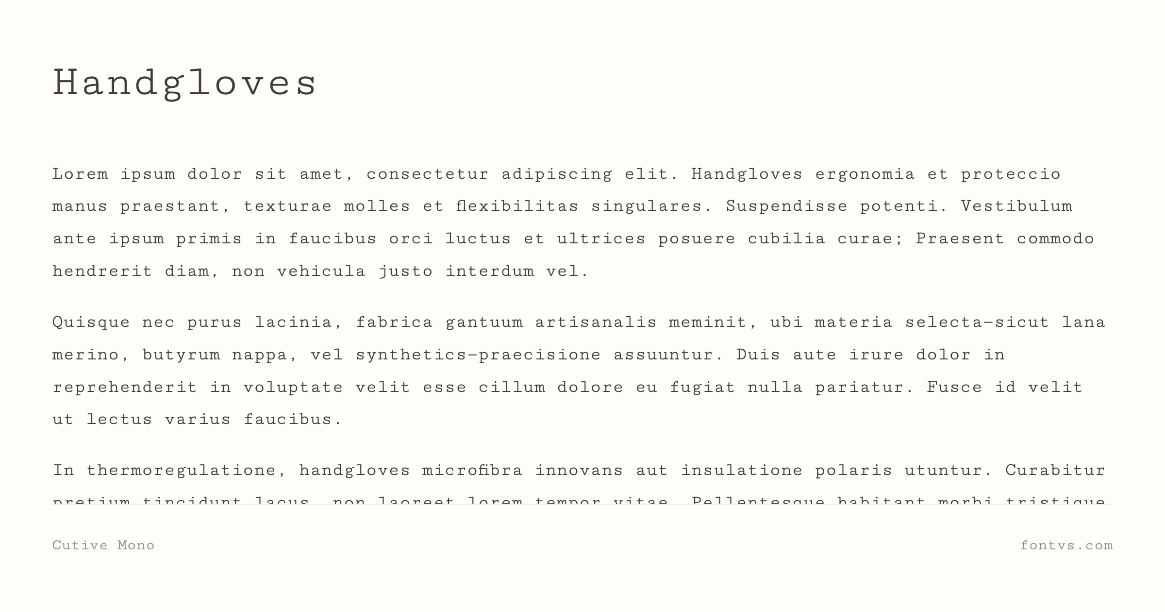
What Makes It Special:
Cutive Mono takes the rough idea of an old office typewriter and cleans it up: slabby serifs, vertical stress, and typewriter spacing, but with smoother curves and more disciplined alignment than truly distressed faces. It’s categorized as a display‑leaning monospace on Google Fonts, yet it stays calm and readable enough for body text, especially in technical or editorial contexts where you want a typewriter feel without smudges or grunge. The glyph set is reasonably generous, covering Latin languages with accents and essential symbols.
Best Used For:
- Body copy with a typewriter flavor — Great for articles, documentation, and long‑form reading where Courier feels too dated or heavy
- Code samples and technical UI — Its slab serifs give code blocks personality while remaining highly legible
- Retro‑modern branding — Nice for brands that want a hint of typewriter heritage but prefer a more polished, contemporary feel
- Captions, tables, and forms — The clean monospaced grid helps with alignment while the typewriter DNA keeps things from feeling sterile
Technical Details:
| Property | Value |
|---|---|
| Family Name | Cutive Mono |
| Version | Version 1.110; ttfautohint (v1.8.4.7-5d5b) |
| Glyphs | 452 |
| Characters | 439 |
| Designer | Vernon Adams |
| Manufacturer | Vernon Adams |
| License | SIL Open Font License (Free for commercial use) |
| PostScript Name | CutiveMono-Regular |
| Font Details | Test it on FontVS |
| Download | Get it from Google Fonts |
Pro Tip: Cutive Mono shines when you let it breathe—use slightly larger sizes and generous line spacing, and pair it with its proportional sibling Cutive or a light grotesk sans for headings to build a clean, contemporary “typewriter‑but‑make‑it‑modern” layout.
11. Silva
Silva is a digital revival of an unusual, wide Olivetti typewriter typeface, digitized and released by typewriter historian Richard Polt on his “Classic Typewriter Page.” It belongs to a small set of fonts he created directly from impressions of original Olivetti single‑element electric typewriters, alongside designs such as Esteem, Kent, and Venezia.
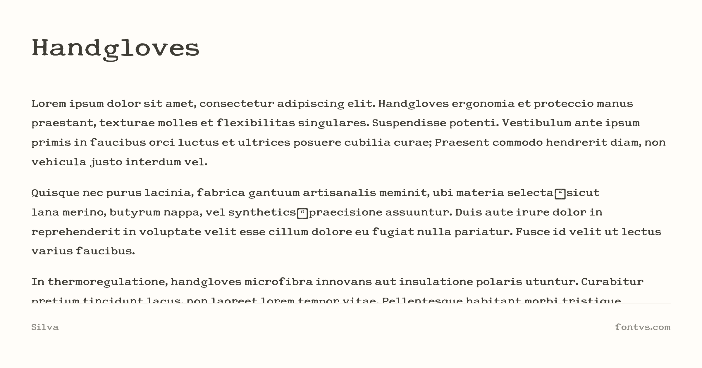
What Makes It Special:
Unlike narrow, dense typewriter faces, Silva is notably wide, with generous horizontal spacing that gives lines a relaxed, airy feel while still looking like genuine typewriter output. The forms themselves are clean, fairly low‑contrast slabs, so you get that “typed” texture without heavy distress or smudging, which makes documents feel authentic but not messy. Because it’s based on Olivetti single‑element electric machines, it carries a mid‑century modern, European flavor rather than the more familiar American office Courier look.
Best Used For:
- Mid‑century editorial layouts — Perfect for essays, zines, and spreads that want a continental, Olivetti‑style typewriter voice instead of generic Courier
- Letters, diaries, and memos — Great for personal documents that should feel typed, but clean and easy to read
- Branding and posters with a European retro tone — Works well for cafés, bookstores, and cultural projects referencing Italian or design‑centric heritage
- Interface mockups and props — Ideal for UI or film graphics where the typewriter needs to look “real” but not overly distressed
Technical Details:
| Property | Value |
|---|---|
| Family Name | Silva |
| Version | Version 001.002 |
| Glyphs | 95 |
| Characters | 93 |
| Designer | Richard Polt |
| License | CC0 public domain dedication(Free for commercial use) |
| PostScript Name | Silva |
| Download | Get it from Official Website |
Pro Tip: Because Silva is wider than most typewriter faces, it looks best with relatively short line lengths and slightly tighter line spacing—use it for titles, letters, or short passages, and pair it with a neutral sans or serif for longer reading to keep layouts from feeling too airy.
Part 3: The Muilt-language Typewriter Fonts
Vintage aesthetics and the “inky” soul are not limited to the Latin alphabet. In this final section, we explore a unique category of typefaces that bring the mechanical charm of typewriters and early 20th-century printing presses to East Asian and South Asian scripts.
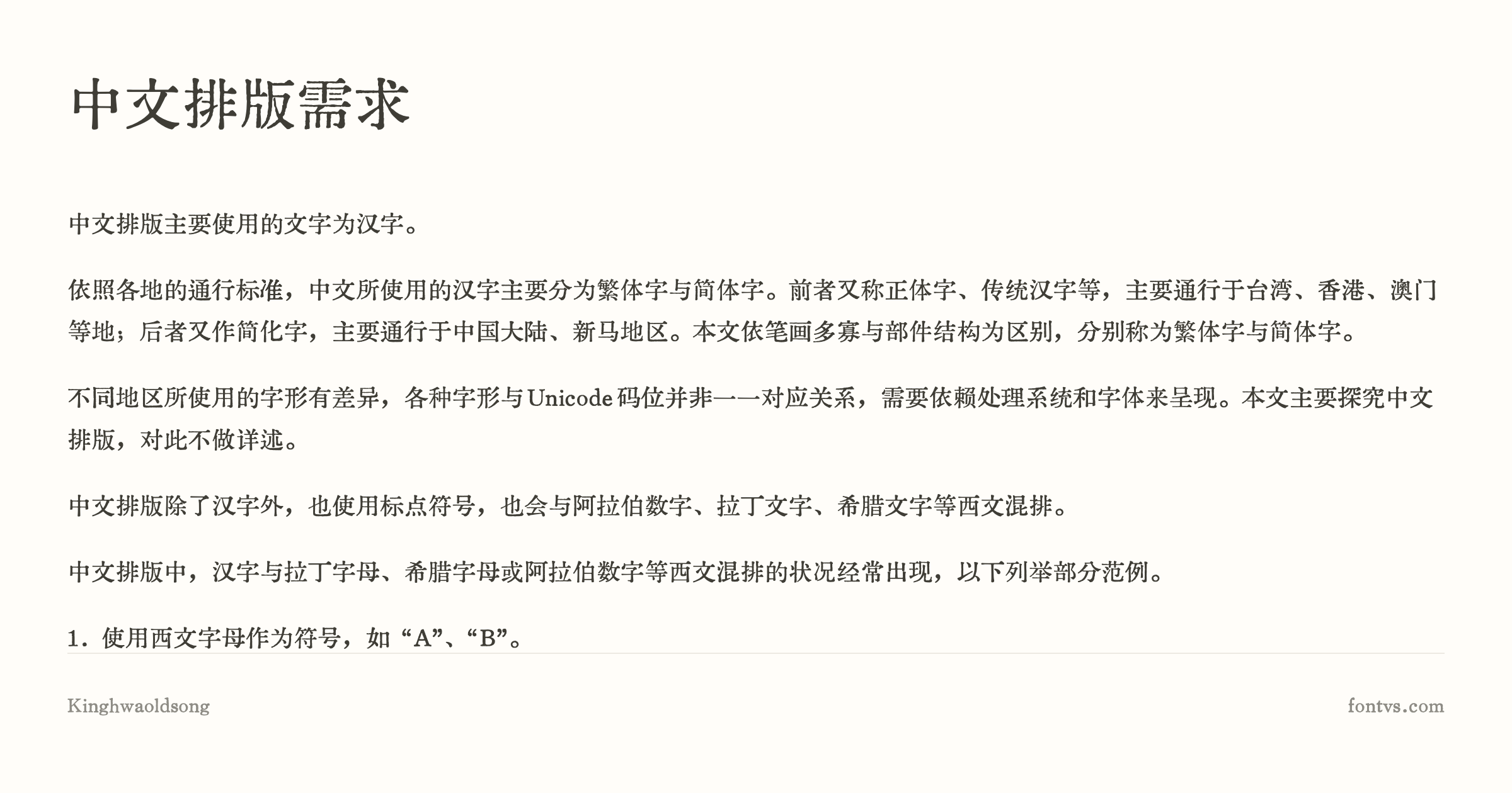
12. KingHwa OldSong(京華老宋体)
KingHwa OldSong is a free, AI‑assisted Chinese text face created by the designer TerryWang, based on the 1961 Beijing Xinhua Type Foundry metal type known as the Laozhudi 61‑1 Song style. It meticulously recreates the look of 1960s Chinese letterpress printing, with over 36,000 Han characters digitized for real‑world publishing and design.
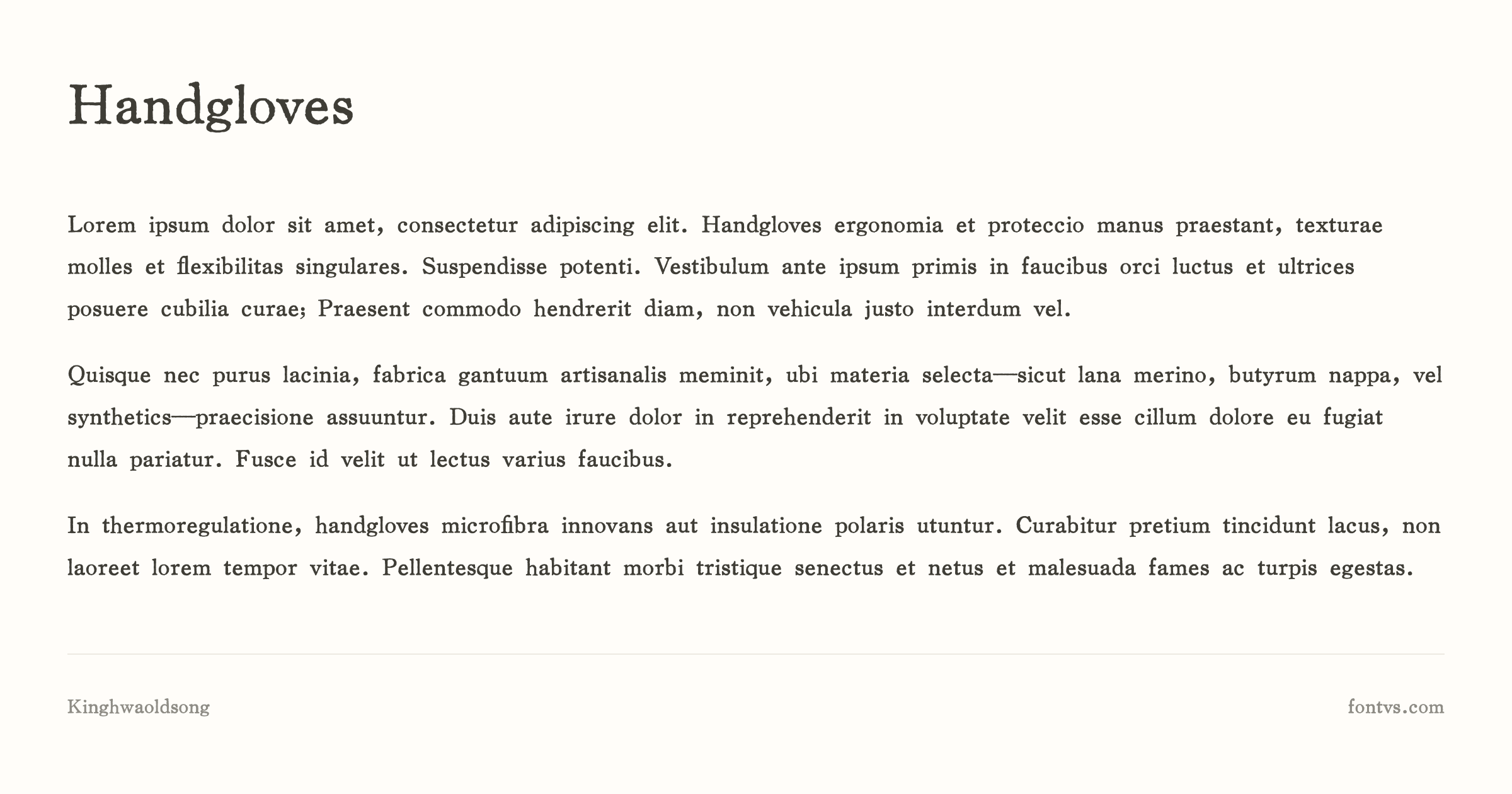
What Makes It Special:
The font consciously preserves classic Old Song features such as peach‑shaped dots, goose‑head hooks, and triangular shoulders, giving strokes a richly sculpted, almost engraved quality. Compared with contemporary Songti (like “Song Second”), KingHwa OldSong feels heavier, rounder, and more tactile, closely matching the slightly inky, pressed look of mid‑20th‑century Chinese books and dictionaries. Because it was built from scans of original metal‑type prints and refined with AI cleanup, it captures the subtle irregularities and weight distribution of old hot‑metal text rather than a modern, vector‑clean aesthetic.
Best Used For:
- Book interiors and historical reprints — Perfect for recreating the feel of 1960s Chinese textbooks, reference books, or literary series
- Cultural and heritage branding — Ideal for museums, cultural festivals, traditional products, or any project that wants a strong “old printing” atmosphere
- Editorial and poster design — Great as display Chinese text for titles, pull quotes, and large typographic layouts where the old‑Song texture can shine
- UI mockups referencing old print — Useful for interfaces or on‑screen props that need to evoke mid‑century Chinese documents
Technical Details:
| Property | Value |
|---|---|
| Family Name | KingHwa OldSong / 京華老宋体 |
| Version | Version 3.000;June 10, 2025;FontCreator 15.0.0.3015 64-bit |
| Glyphs | 40223 |
| Characters | 39573 |
| Designer | 特里王(TerryWang) - 王廷瑞 |
| License | Freely use, distributable, but non-sellable standalone, unmodified and non-educational |
| PostScript Name | KingHwaOldSong |
| Download | Get it from Author’s Post |
Pro Tip: Use KingHwa OldSong at comfortable reading sizes and avoid heavy letter‑spacing—let the naturally thick‑and‑round strokes sit tightly, and pair it with a clean Latin serif or mono for English text so the Chinese keeps the starring role in your “old‑printing” aesthetic.
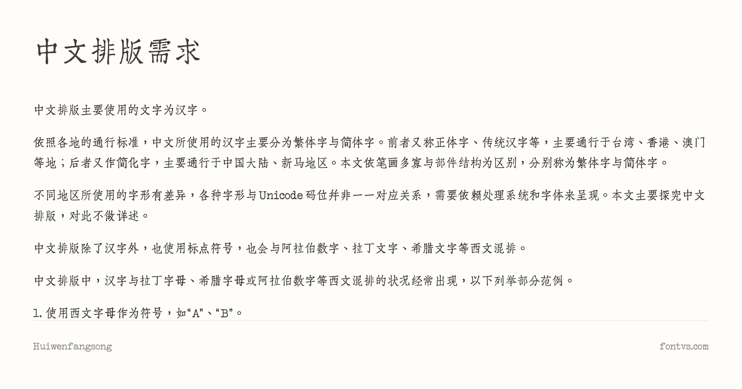
13. Huiwen Fangsong(汇文仿宋)
Huiwen Fangsong is a free, commercially usable Chinese Fangsong typeface from the same designer TerryWang, intended as a faithful digital revival of the Xinhua Type Foundry’s metal 59‑4 Fangsong. That metal face itself was a revision of the influential Huafeng Zhensong style, one of the most widely used early Fangsong designs.
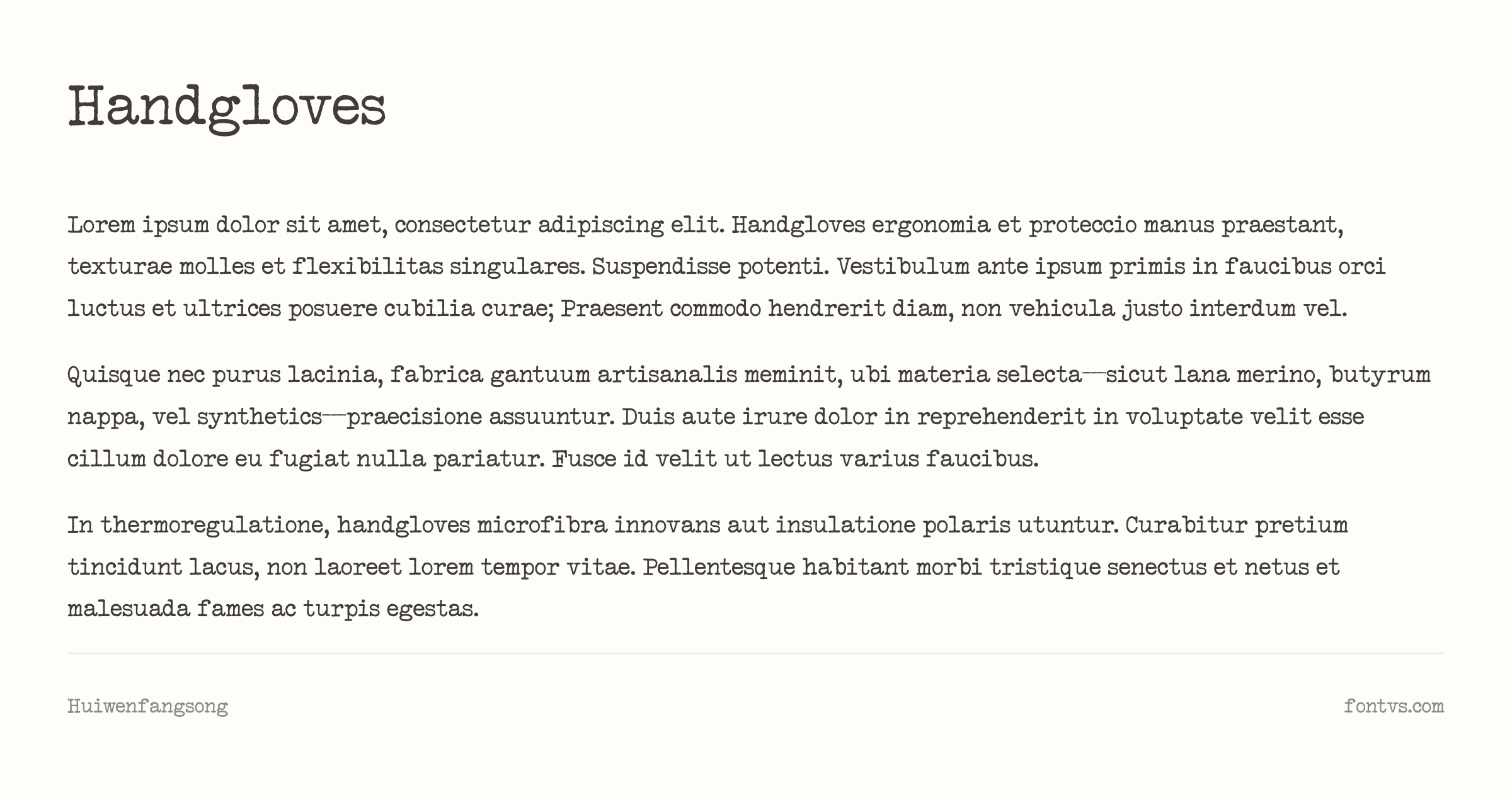
What Makes It Special:
Huiwen Fangsong restores the look of early‑reform‑era 59‑4 Fangsong, including many subtle “刻本” (woodblock‑like) features that were later removed in more standardized modern fonts. The strokes balance the brush‑like elegance of printed Fangsong with the slight stiffness of metal type, giving text a distinctively archival, bookish texture well suited to quotations, classical texts, and formal documents. The author also notes that the font quietly brings back some Huafeng Zhensong‑style alternate glyphs as substitutions for enthusiasts who want an even older flavor.
Best Used For:
- Classic book and document layouts — Excellent for quotations, essays, and annotations that should feel like they were set in 1950s–60s lead type
- Engineering drawings and technical documents — Its original usage included formal documents and diagrams, making it a good fit for technical, archival‑styled content
- Cultural posters and print graphics — Great for posters, signage, and cultural campaigns emphasizing tradition and scholarship
- Pairing with typewriter Latin faces — Works nicely alongside Latin typewriter fonts when you’re mixing English and Chinese in a retro editorial layout
Technical Details:
| Property | Value |
|---|---|
| Family Name | Huiwen Fangsong / 汇文仿宋 |
| Version | V 1.002 |
| Glyphs | 22351 |
| Characters | 22296 |
| Designer | 特里王(TerryWang) - 王廷瑞 |
| License | Freely use, distributable, but non-sellable standalone |
| PostScript Name | HuiwenFangsong-Regular |
| Download | Get it from Author’s Post |
Pro Tip: Huiwen Fangsong is strongest when you let its vertical rhythm and Fangsong contrast breathe—use it for multi‑line passages, classical citations, or sidebars, and contrast it with a bolder display or typewriter Latin for headings so the delicate, old‑print Fangsong texture doesn’t have to compete with heavy forms.
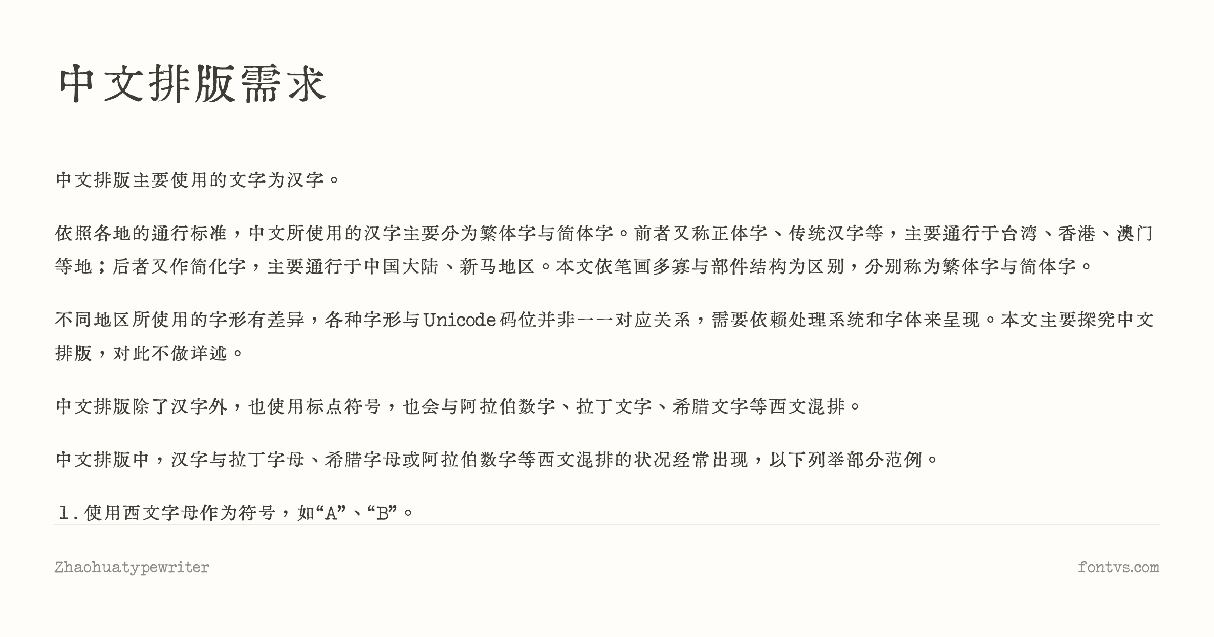
14. Zhaohua TypeWriter(朝华打字机)
Zhaohua Typewriter is a Chinese‑centric typewriter‑style Ming typeface also produced by TerryWang as part of the “Zhaohua” series, explicitly designed to emulate the feel of a typewriter face for Chinese plus multiple scripts. It includes simplified and traditional Chinese, Latin, Cyrillic, Japanese, and Greek, with Latin letters and numerals carefully drawn to mimic real typewriter metal type.
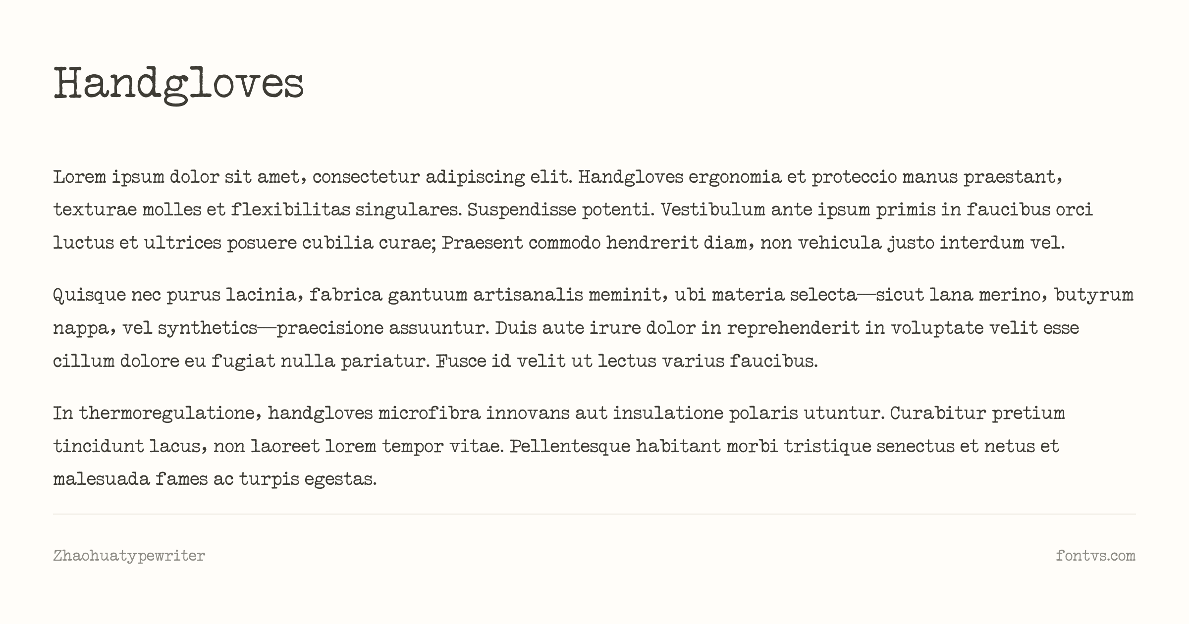
What Makes It Special:
The author describes Zhaohua Typewriter as a thin Ming font “for use on typewriters,” with Western letters and digits specifically crafted to match the shape and feel of typewriter slugs. Outlines are intentionally a bit rough and “chewed,” giving strokes a lightly eroded texture—like a well‑used office typewriter printing onto slightly rough stock—while still preserving legibility. Because the font intentionally includes many non‑standard character forms by modern orthographic rules, it carries a strong pre‑standardization, archival flavor that can make text feel like it came straight from an old report or typescript.
Best Used For:
- Retro Chinese/JP multi‑script documents — Ideal when you need Chinese, Japanese, and Latin all to look like they were typed on the same machine
- Props, interfaces, and story worlds — Great for film/game UI, dossiers, and in‑story documents that rely on a believable, typewriter‑like face with East Asian support
- Posters and title pages — Works well for big headlines and covers that want a thin, crisp Ming typewriter aesthetic rather than heavy slab serifs
- Experimental layouts — Because it includes non‑standard forms, it’s ideal for artistic, speculative, or alt‑history projects rather than strict official publishing
Technical Details:
| Property | Value |
|---|---|
| Family Name | Zhaohua Typewriter / 朝华打字机 |
| Version | Version 1.001;March 17, 2026;FontCreator 15.0.0.3015 64-bit |
| Glyphs | 32510 |
| Characters | 32464 |
| Designer | 特里王(TerryWang) - 王廷瑞 |
| Manufacturer | TerryFontArt |
| License | Freely use, distributable, but non-sellable standalone and non-educational |
| PostScript Name | ZhaohuaTypeWriter-Light |
| Download | Get it from Author’s Post |
Pro Tip: The author explicitly warns that Zhaohua Typewriter includes many non‑standard character forms and should not be used in contexts that require strict adherence to current orthographic norms (especially education); treat it as a stylized, atmospheric typewriter face for design, media, and storytelling, not for official documents.
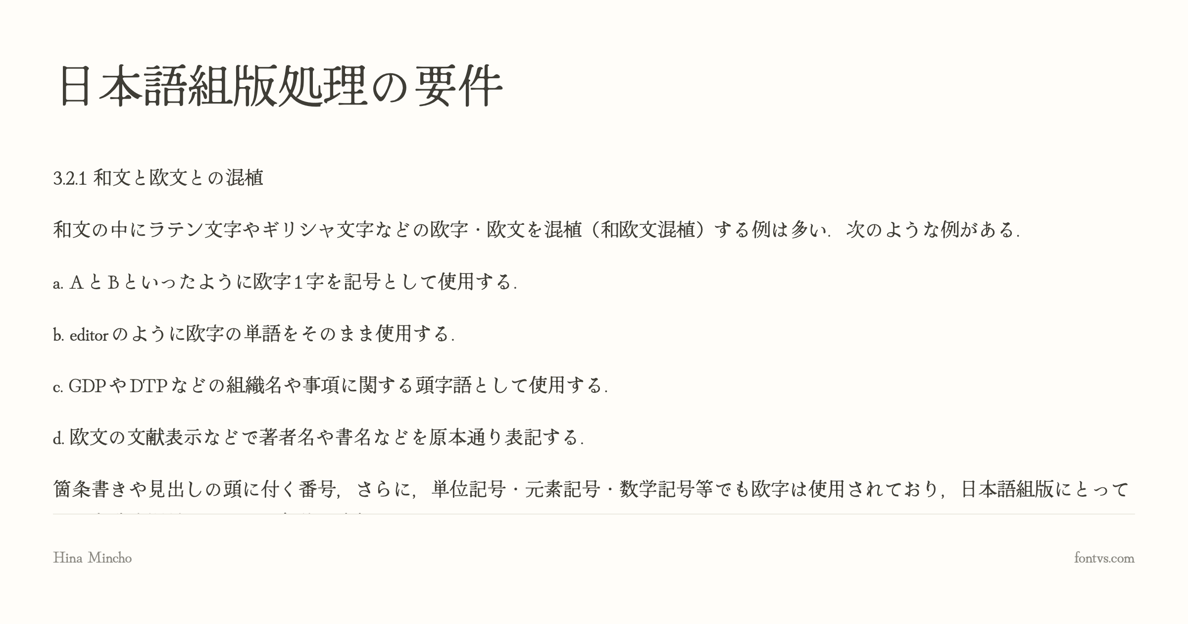
15. Hina Mincho(ひな明朝)
Hina Mincho (ひな明朝) is an open‑source Japanese Mincho typeface by designer Satsuyako, distributed through Google Fonts and Adobe Fonts. It blends traditional Mincho elegance with a slightly playful, “old‑fashioned and cute” tone, and includes extended Latin and Cyrillic support alongside full Japanese coverage.
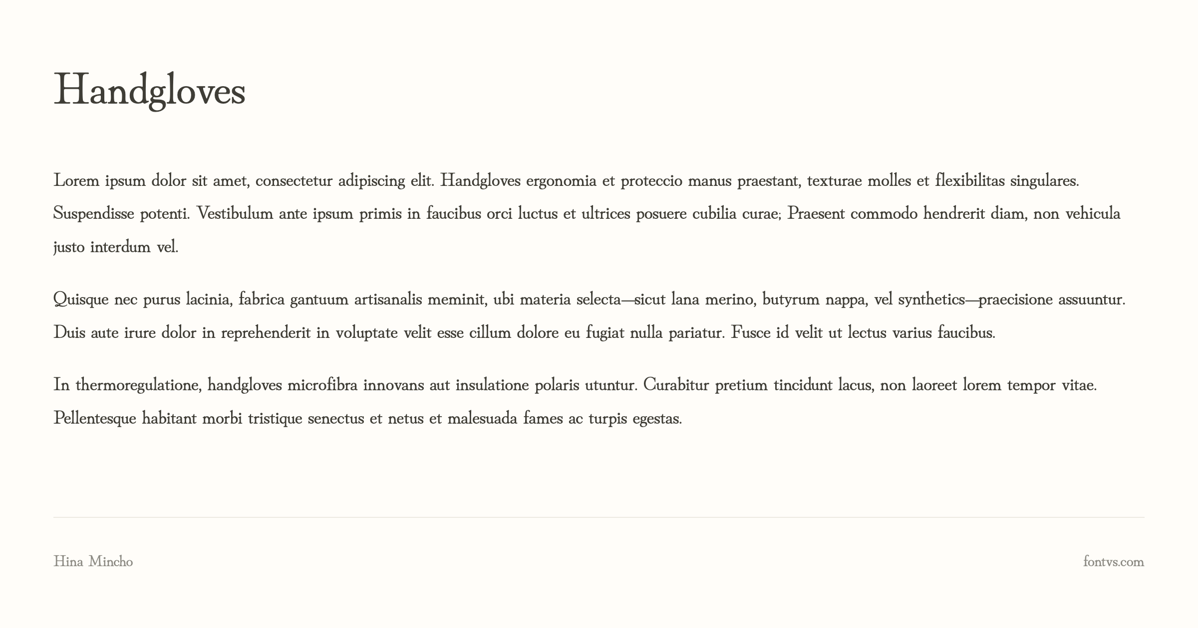
What Makes It Special:
Unlike purely sober book Mincho faces, Hina Mincho deliberately introduces a sense of fun: strokes often end in soft, rounded terminals, and some brush shapes are inspired by the silhouette of birds in motion. The font emphasizes narrow “futokoro” (internal spaces) and lively sweeping curves, which, combined with visible “ink pool” effects at stroke junctions, gives text a subtly inky, handwritten‑meets‑print feel. At the same time, it follows Mincho structure closely enough to stay highly legible in body text, making it a rare mix of classical seriousness and gentle charm.
Best Used For:
- Japanese editorial and book design — Great for novels, essays, or magazines that want classical Mincho readability with a slightly softer, more approachable tone
- Covers and title treatments with “ink” character — The ink‑pool details and bird‑like strokes shine in large headings, where their organic curves are clearly visible
- Multilingual projects (JP + Latin + Cyrillic) — Because it ships with Google Latin Plus and Cyrillic, you can create bilingual or trilingual layouts while maintaining a cohesive serif voice
- Web and UI with a traditional Japanese mood — Works well as a display font in interfaces or hero sections that reference Japanese print culture and old books
Technical Details:
| Property | Value |
|---|---|
| Family Name | Hina Mincho / ひな明朝 |
| Version | Version 1.100 |
| Glyphs | 8272 |
| Characters | 7965 |
| Designer | satsuyako |
| Manufacturer | satsuyako |
| License | SIL Open Font License (Free for commercial use) |
| PostScript Name | HinaMincho-Regular |
| Font Details | Test it on FontVS |
| Download | Get it from Google Fonts |
Pro Tip: Hina Mincho is at its best when you let its personality breathe—use it for titles, pull‑quotes, and medium‑length text at slightly larger sizes, and pair it with a neutral sans‑serif (for example, Noto Sans JP or Inter) so the inky Mincho details remain the visual focus instead of fighting other decorative faces.
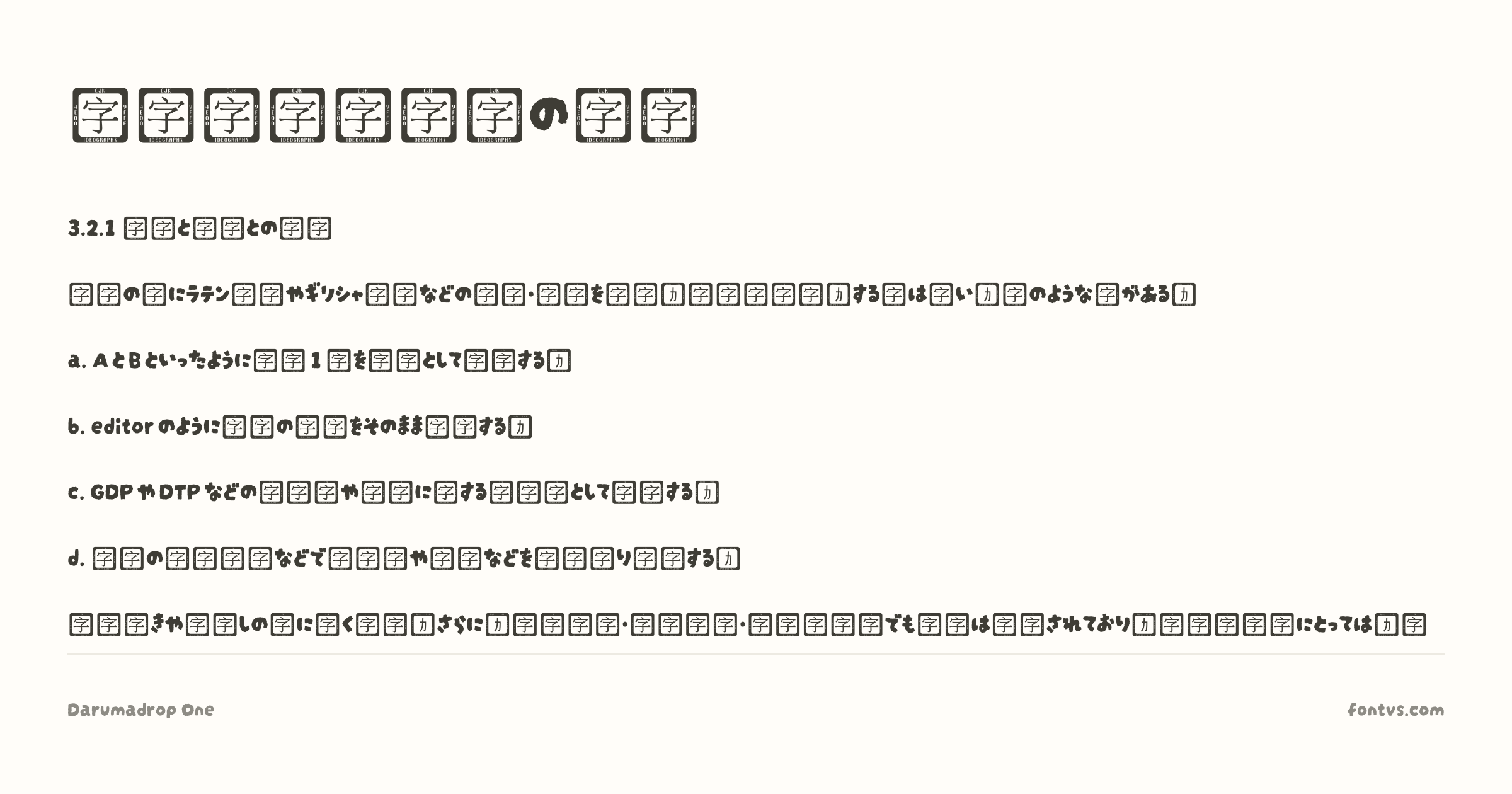
16. Darumadrop One
Darumadrop One is a playful display typeface created by Japanese studio Maniackers Design specifically for Google Fonts. Inspired by Japanese handwriting and the traditional “Daruma Otoshi” toy, it mixes bouncy, rounded strokes with an irregular, almost brush‑like texture that feels like thick marker ink soaking into paper.
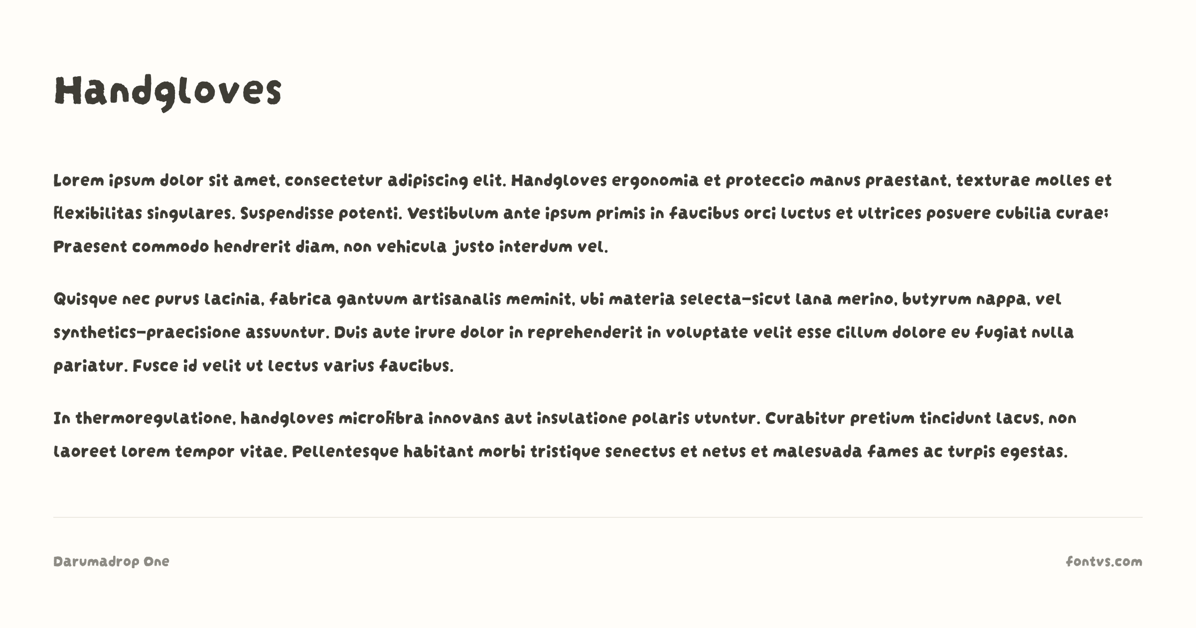
What Makes It Special:
Darumadrop One has a friendly, slightly wobbly skeleton—strokes swell and pinch in unexpected places, giving each glyph a hand‑drawn warmth that never feels mechanical. The letterforms are chunky and rounded, with enough irregularity to suggest ink spread and imperfect pressure, especially in the Japanese kana where strokes twist and bend like real marker lines.
The Darumadrop One font supports both Japanese kana and Latin scripts, but the Japanese kanji characters are not supported.
Best Used For:
- Japanese‑inspired branding and menus — Perfect for ramen shops, izakaya menus, event posters, and packaging that wants a warm, hand‑painted storefront sign look
- Children’s books and playful titles — Its soft curves and “mischievous” rhythm make it ideal for kids’ covers, educational materials, and whimsical chapter headings
- Posters, stickers, and merch — Great for bold headlines on tote bags, badges, and street‑style graphics where you want a loud, inky personality
- Motion graphics and anime‑style overlays — Works beautifully for title cards, intertitles, and on‑screen text in videos or games that reference Japanese pop culture
Technical Details:
| Property | Value |
|---|---|
| Family Name | Darumadrop One |
| Version | Version 1.000 |
| Glyphs | 526 |
| Characters | 523 |
| Designer | Maniackers Design |
| License | SIL Open Font License (Free for commercial use) |
| PostScript Name | DarumadropOne-Regular |
| Font Details | Test it on FontVS |
| Download | Get it from Google Fonts |
Pro Tip: Darumadrop One really comes alive at big sizes—think 32pt and above—where its wobbly outlines and “ink blob” terminals are clearly visible; combine it with subtle grainy textures and flat, poster‑style color blocks to make it feel like hand‑screen‑printed type rather than a digital font.
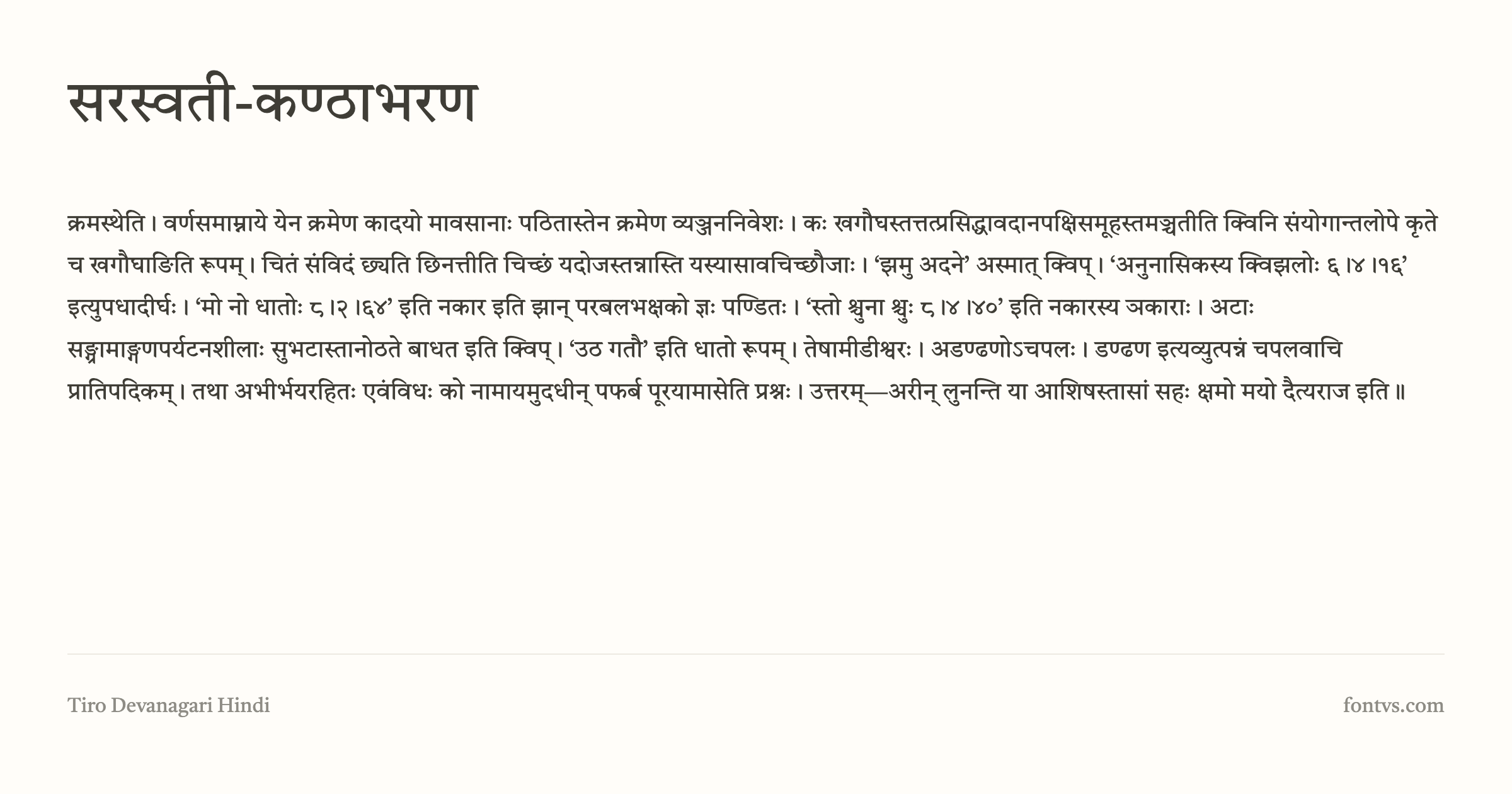
17. Tiro Devanagari Hindi
Tiro Devanagari Hindi is a serif Devanagari typeface from Tiro Typeworks, originally drawn for the Murty Classical Library of India book series and later released as an open‑source family. It brings a contemporary interpretation of 19th–20th‑century metal Devanagari types (especially the Nirnaya Sagar Press tradition) to modern print and screen typography.

What Makes It Special:
Tiro Devanagari Hindi is characterized by relatively broad proportions, generous counters, and strong diagonals and terminals, which together create an open, calm texture that stays highly legible in dense literary settings. The design carefully balances traditional and modern conjunct forms, so it looks at home in classical Hindi texts while still performing well in contemporary layouts and on digital displays. Each font also includes a Latin subset with diacritics for Indological transcription, allowing you to combine Hindi and scholarly Latin annotations in a single, cohesive voice.
Best Used For:
- Books and long‑form Hindi reading — Ideal for novels, essays, religious and philosophical works, and classical literature where readability over many pages is critical
- Academic and scholarly publishing — Built for series like the Murty Classical Library, it’s particularly suited to editions with parallel Devanagari and Latin transliteration or commentary
- High‑quality editorial and web typography — Works very well for serious news, magazine, and documentation sites that need a refined Devanagari text face with good on‑screen behavior
- Pairing with typewriter‑style Latin — For bilingual layouts, you can set Hindi in Tiro Devanagari Hindi and use a “clean & crisp” mono like Courier Prime or Cutive Mono for English, creating a nice contrast between literary Devanagari and machine‑typed Latin text
Technical Details:
| Property | Value |
|---|---|
| Family Name | Tiro Devanagari Hindi |
| Version | Version 1.52 |
| Glyphs | 1388 |
| Characters | 512 |
| Designer | Devanagari: John Hudson & Fiona Ross. Latin: John Hudson. |
| Manufacturer | Tiro Typeworks Ltd. |
| License | SIL Open Font License (Free for commercial use) |
| PostScript Name | TiroDevaHindi-Regular |
| Font Details | Test it on FontVS |
| Download | Get it from Google Fonts |
Pro Tip: Use Tiro Devanagari Hindi at comfortable reading sizes with slightly relaxed line spacing for book or article text, and reserve more decorative or “typewriter‑like” Latin fonts for headings or sidebars—this lets Tiro carry the weight of serious Hindi content while your Latin typewriter face adds character and contrast without sacrificing legibility.
Conclusion: Finding Your Perfect Typewriter Font
With these 17 carefully curated typewriter fonts, you now have a comprehensive toolkit for every vintage design need---ranging from heavily distressed, “freshly-typed” faces to clean, modern interpretations that maintain a nostalgic rhythm.
To achieve the most authentic results, keep these five principles in mind:
- Match the Font to Your Era --- Choose your typeface based on the specific historical “voice” you need. Use 1942 Report for authoritative WWII military documents , or KingHwa OldSong to evoke the letterpress feel of 1960s Chinese publishing.
- Prioritize Readability by Hierarchy --- Not all typewriter fonts are built for long reading. Use heavily distressed faces like Special Elite or CarbonType for bold, inky headlines , while reserving cleaner, modern refinements like Courier Prime or Cutive Mono for body text and scripts.
- Check Licenses for Your Context --- While all these fonts are free, their licenses vary. Most follow the SIL Open Font License or Apache 2.0, making them safe for commercial branding , while others like Huiwen Fangsong are freely distributable but have specific restrictions regarding standalone sale.
- Embrace “True” Mechanical Randomness --- If your project requires an ultra-authentic look, opt for advanced fonts like TT2020. Its use of OpenType contextual alternates ensures that repeated letters never look identical, perfectly mimicking a physical IBM Selectric typewriter.
- Pair Thoughtfully for Balance --- To prevent a layout from feeling dated, balance the gritty texture of typewriter fonts with clean, modern sans-serifs. For example, pairing the wobbly, inky terminals of Darumadrop One with a minimalist grotesk creates a vibrant “retro-modern” aesthetic.
The perfect typewriter font isn’t just about aesthetics---it’s about authenticity. Whether you’re reconstructing historical fiction, crafting a brand with “old-fashioned” charm , or exploring the intersection of code and art with Syne Mono, these 17 fonts will help you capture that elusive, tactile feel of ink on paper.